Caribé Juices
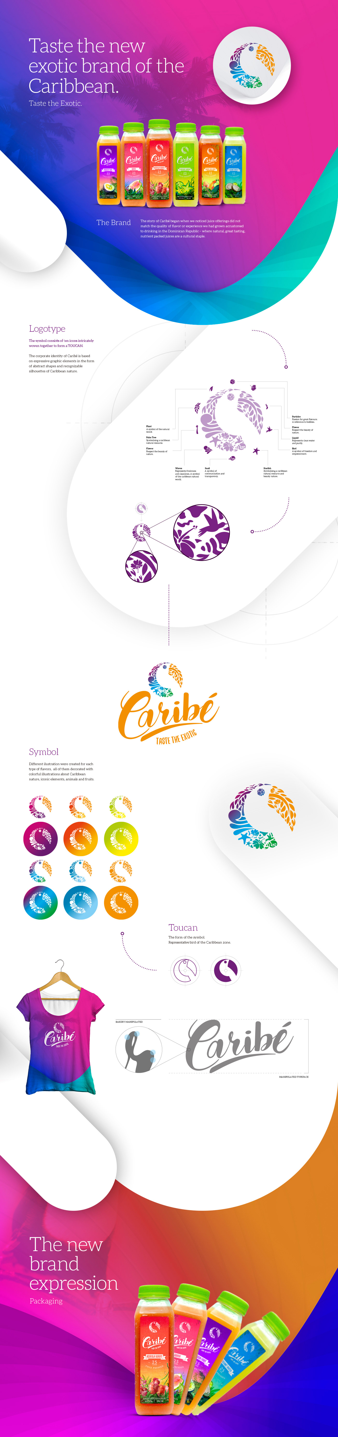
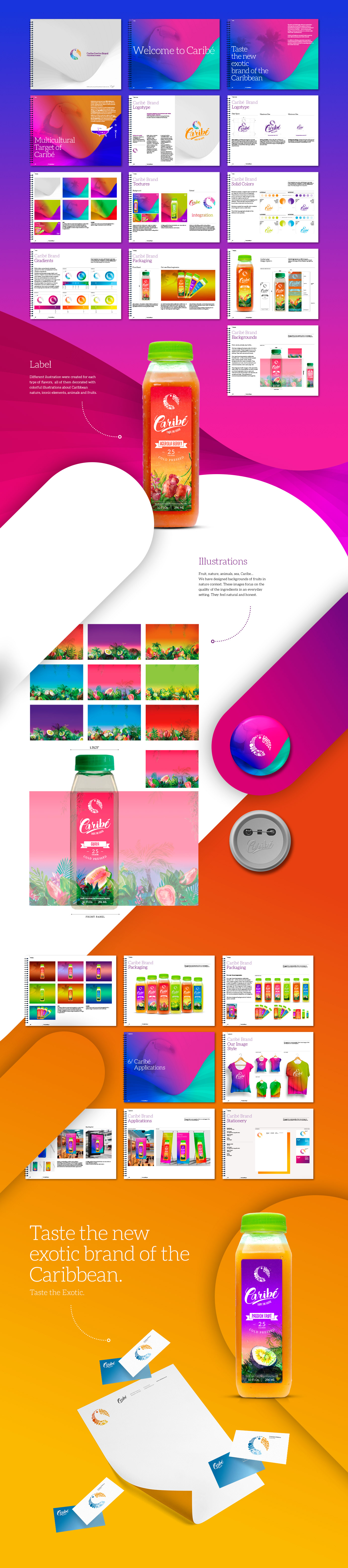
Caribé Juices rebranding and packaging design. The story of Caribé began when we noticed juice offerings did not match the quality of flavor or experience we had grown accustomed to drinking in the Dominican Republic – where natural, great tasting, nutrient packed juices are a cultural staple. Caribé use Dominican-sourced fruits to make the most delicious juices packed with nutrients. The symbol consists of ten icons intricately woven together to form a Toucan. The corporate identity of Caribé is based on expressive graphic elements in the form of abstract shapes and recognizable silhouettes of Caribbean nature. Also we designed illustrations and patterns for each category of flavours and bottles.
Caribé Juices rebranding and packaging design. The story of Caribé began when we noticed juice offerings did not match the quality of flavor or experience we had grown accustomed to drinking in the Dominican Republic – where natural, great tasting, nutrient packed juices are a cultural staple. Caribé use Dominican-sourced fruits to make the most delicious juices packed with nutrients. The symbol consists of ten icons intricately woven together to form a Toucan. The corporate identity of Caribé is based on expressive graphic elements in the form of abstract shapes and recognizable silhouettes of Caribbean nature. Also we designed illustrations and patterns for each category of flavours and bottles.